CSS Grid is a powerful tool for creating complex layouts using a grid-based system. Here are the key Grid properties and examples of their usage.
Grid Container Properties
- display: grid; / display: inline-grid;
- Sets an element as a grid container.
   .container {
     display: grid;
}- grid-template-columns / grid-template-rows
- Defines the number and sizes of columns/rows.
   .container {
     grid-template-columns: repeat(3, 1fr); /* three columns of equal width */
     grid-template-rows: 100px auto; /* first row 100px, second row auto */
}- grid-template-areas
- Allows you to name grid areas for easy item placement.
   .container {
     grid-template-areas:
       'header header header'
       'sidebar main main'
       'footer footer footer';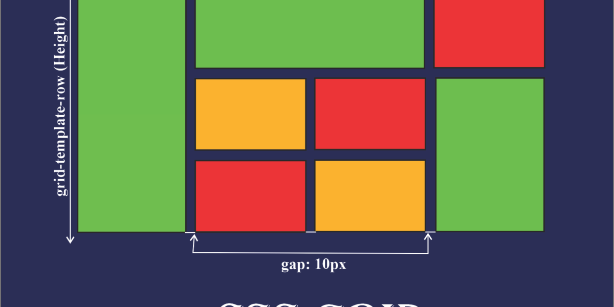
}- grid-gap / column-gap / row-gap
- Sets gaps between columns and rows.
   .container {
     grid-gap: 10px; /* gap between all rows and columns */
   }
Grid Item Properties
- grid-column / grid-row
- Defines where an item should start and end within the grid.
   .item {
     grid-column: 1 / 3; /* item spans the first and second columns */
     grid-row: 1 / 2; /* item spans the first row */
}- grid-area
- Used to place an item in a specific named area defined by
grid-template-areas.
   .header {
     grid-area: header; /* item is placed in the "header" area */
}- justify-self / align-self / place-self
- Defines the alignment of the item within its grid cell.
   .item {
     justify-self: center; /* horizontal alignment */
     align-self: center; /* vertical alignment */
}- grid-auto-flow
- Controls how items are placed in the grid when they are not explicitly positioned.
- Values:
row(default),column,row dense,column dense.
   .container {
     grid-auto-flow: row; /* items are placed by rows */
   }